The internet is now old enough to have it’s own myths. One day it might have its own Iliad or folk talkies. For now, the only mythical things around here are some beliefs that people have when it comes to web design and websites in general.
For example, they believe that…
1. All content is created equal.
Wrong, wrong, wrong, so so sooo wrong.
Before explaining why, keep in mind that information doesn’t equal content. While the same information may be present on multiple sites, the way in which you present that information is crucial. Consider content your own spin, your own way to present that information; maybe via infographics, lists, with images or without. You get the idea.
The gist of it when creating content is to make it readily available for everybody that is going to access your website. Minimalistic is the way to go, because a new user can become easily overwhelmed by overcrowding your website. The content that people are searching for should be easily accessible, with a short loading time and with the quickest way to get your point across. This way you can lower your bounce rate and increase your session durations.
2. Your homepage is your one and only holy grail
Yes, it’s true, usually the homepage is the first interaction that a user, a potential client even, might have with your business. IF it’s done right, it should fit like a glove for your user and feel like it was designed with them in mind.
And I said IF, with capitals. As I said before, don’t overwhelm your user with every product, service, information, company value, and offers. It’s more important to create a clear path for your user so they can explore your website as they see fit; that’s why it’s more important to have a good structure and organization to your website rather than have everything on the front page.
3. Once your website is live you don’t need to touch it up ever again
The road to launching your website is long, full of unforeseen hurdles and extra problems. Going live with it seems like the light at the end of the tunnel, the promised land, where no troubles ever bother you.
Too bad it’s just not true.
Going live with your website is another step towards your success as a business, but that doesn’t mean that it’s a one and done thing. To actually draw customers and conversions you need to stay relevant and active on your site. Maintain people’s attention with news and articles in a blog, be engaging in online events (we already have the solution for that here); A/B testing is your friend! Test new and different landing pages and contact forms and see what yields better results.You should also think about optimizing, monitoring and seeking ways to improve the performance of the site. Unfortunately, this is a never ending job, as many issues pertain to SEO whims (which can be understood better with this article).
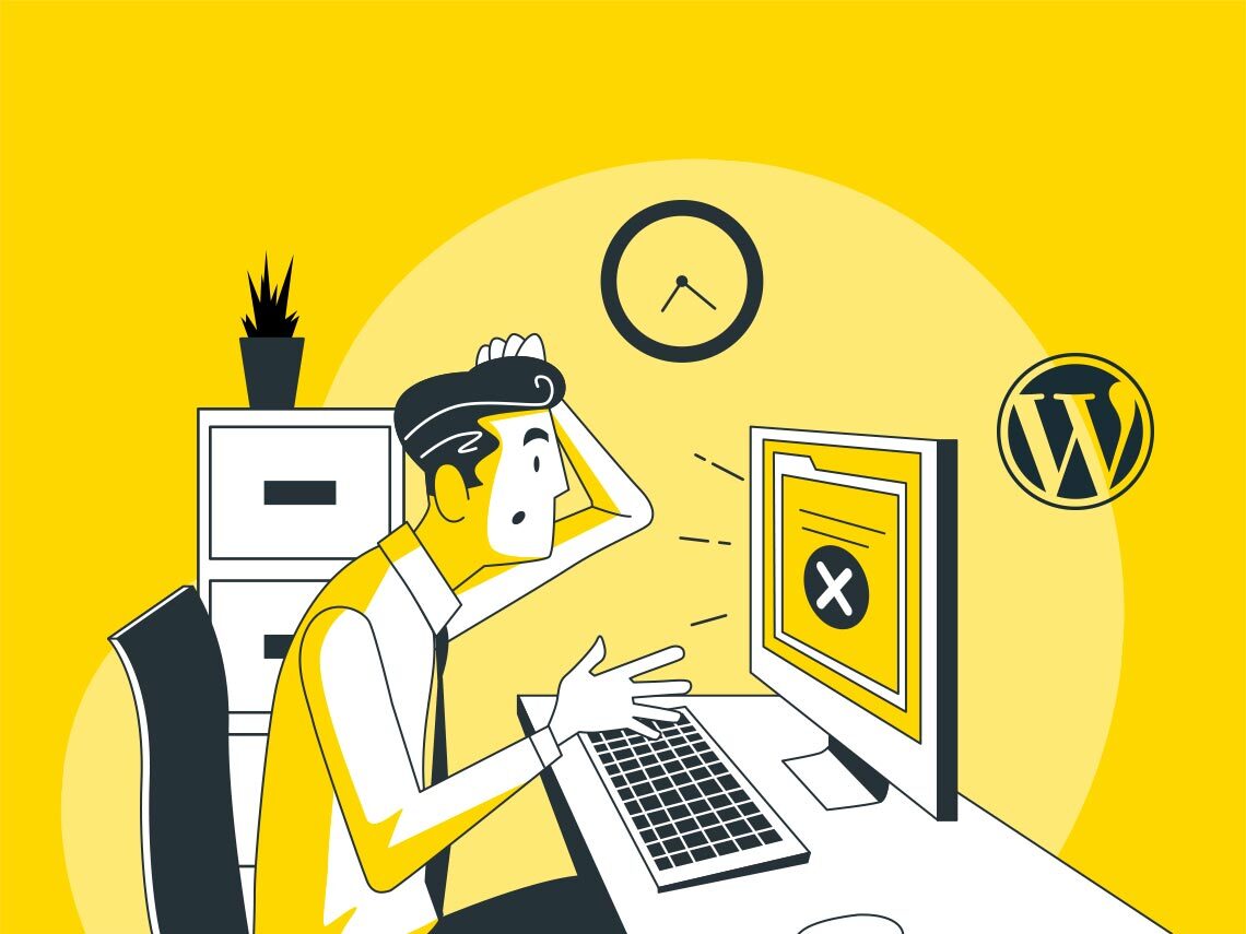
4. Desktop versions are enough
Do we really need to discuss this? Who, in this day and age, doesn’t use at least once (once!) a day a mobile version of a site or web app? The facts don’t lie. Users who have a negative experience in your mobile store are 62% less likely to purchase from you in the future, 40% say they use their mobile device to conduct research prior to making a purchase (PixelUnion, 2019) and an average person spends 2 hours and 51 minutes per day on their mobile device (Leftronic, 2021).
Need I go on? Plain and simple, if your website doesn’t have a good mobile version you risk losing a ton of traffic, users and customers. Go all in when it comes to (re)doing your website and don’t skip out the mobile version.
5. Accessibility means having a good mobile version
Kinda continuing from the point before, just having a mobile version isn’t enough to call your website accessible. There are many ways to render your site accessible, inclusive and usable for everybody that could. The Bureau of Internet Accessibility is one of the biggest, oldest and most respected institutions that focus on accessibility on the internet; they even have guidelines (that have been developed over the last two decades, by the way) that are followed by almost the whole internet.
You can start with the essentials. There are free audits on their site and they have their guidelines also listed there. Specifically, you can add alt-text to all images, videos and graphics on your website, keep any tables on your website as simple as they can be, avoid playing videos automatically and think of restructuring carousels since both of them don’t work with a lot of assistive technology.
What would you consider another web design myth? Let’s talk!